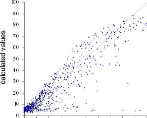
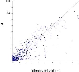
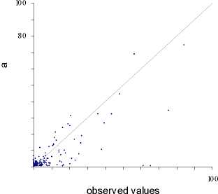
It should be observed that, from a statistical point of view, the results are quite good for
the residential use, a little less for the industry and not so good for the commerce. The
difference is probably due to the different sample size for the three land uses. Since the
recent urbanisation process in the south of Milan concerns mainly residential sprawl,
many records are “good examples” for this land use. On the contrary the commercial
use, which is the less frequent, gives the worst results. This is shown on the scatter
diagram of observed (on the x axis) and calculated values (on the y axis) for each land
use (figures 6 a, b and c).
The spatial representation of “errors” allows to evaluate the spatial logic of the SANNs
output.
Figure 7 shows the errors concerning the residential land use. Errors are measured in
ratio over the whole cell surface. One large underestimation is evident, just in the centre


(a) (b)
Figure 6 - The scatter diagrams of observed and calculated values of land use in each cell
of an agricultural area totally not urbanised and not infrastructured. This is due to an
entirely new settlement for affluent people, “Milano 3”, which is the result of a
negotiation between big investors and the local municipality. Evidently it was
impossible for the SANN to predict an event which is totally extraneous to his logic.
Other errors are mainly due to planning constraints, often forbidding a “natural” growth
and forcing the development elsewhere. As mentioned earlier in this experiment road
infrastructures have been ignored, whereas their topical role emerges in the already
mentioned SOM classification.
13
More intriguing information
1. 5th and 8th grade pupils’ and teachers’ perceptions of the relationships between teaching methods, classroom ethos, and positive affective attitudes towards learning mathematics in Japan2. INTERACTION EFFECTS OF PROMOTION, RESEARCH, AND PRICE SUPPORT PROGRAMS FOR U.S. COTTON
3. ALTERNATIVE TRADE POLICIES
4. The name is absent
5. Natural hazard mitigation in Southern California
6. THE EFFECT OF MARKETING COOPERATIVES ON COST-REDUCING PROCESS INNOVATION ACTIVITY
7. The English Examining Boards: Their route from independence to government outsourcing agencies
8. The name is absent
9. Strategic Policy Options to Improve Irrigation Water Allocation Efficiency: Analysis on Egypt and Morocco
10. Are combination forecasts of S&P 500 volatility statistically superior?