Technical note 3: Economic efficiency
This relates to the relation between inputs and outputs or outcomes. A
distinction is drawn between technical and allocative efficiency. The former
relates to doing well whatever it is that one does. The latter relates to doing
the right thing.
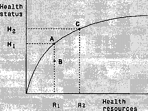
This can be seen in the figure (adapted from Evans 1984). The diagram
shows the relationship between health status on the vertical axis and
resources allocated to health care on the horizontal axis. The question of
how health status should be measured is avoided here. The curve
represents the maximum health produced for each level of input.
If a particular health
program is being funded
to the level R1, then it
should be achieving
outcomes equal to H1.
This is point A on the
diagram. If it is achieving
anything less (point B),
the service is technically
inefficient. Reorganising
work practices would
allow better health
outcomes top be achieved
for the same level of
resources. Any point
below the curve is
technically inefficient.

which point on the possible curve is the right point? Increased funding
from R1 to R2 would increase health outcomes (from A to C) but at what
cost? The opportunity cost is not simply the difference between R1 and R2.
Remembering that the additional resources could be spent either on this
program or on another program, the opportunity cost is the forgone change
in welfare from the most preferred alternative program. This is allocative
efficiency.
There is something else to note from this diagram, As the diagram is
drawn, successive increases in resources yield positive benefits in terms of
health status but at a diminishing rate. Thus, initially, the returns to
health care expenditure are large (life saving treatments) but the returns
get smaller as treatment is extended into the reduction of severe and then
less severe morbidities. This is diminishing returns.
11
More intriguing information
1. The name is absent2. AGRICULTURAL TRADE IN THE URUGUAY ROUND: INTO FINAL BATTLE
3. Herman Melville and the Problem of Evil
4. Opciones de política económica en el Perú 2011-2015
5. The name is absent
6. Public-Private Partnerships in Urban Development in the United States
7. Income Mobility of Owners of Small Businesses when Boundaries between Occupations are Vague
8. Auction Design without Commitment
9. Social Cohesion as a Real-life Phenomenon: Exploring the Validity of the Universalist and Particularist Perspectives
10. Shifting Identities and Blurring Boundaries: The Emergence of Third Space Professionals in UK Higher Education