15
Graphical Data Representation in Bankruptcy Analysis

Variable No.
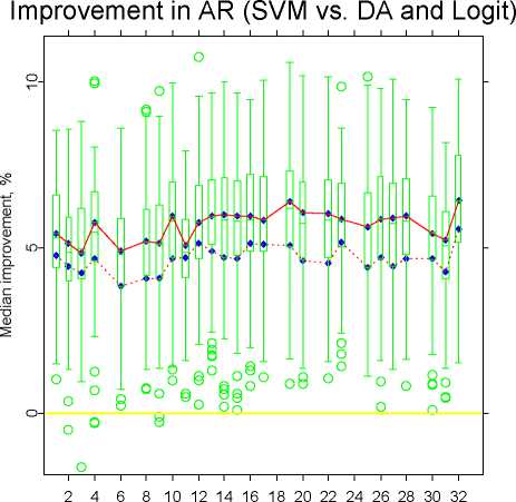
Fig. 11. Median improvement in AR. SVM vs. DA (the upper line) and SVM
vs. logit regression (the lower line). Box-plots are estimated basing on 100 random
subsamples for the case of DA. Each model includes variables K5, K29, K7, K33,
K18, K21, K24 and one of the remaining
Red colour is often used in finance to highlight negative information, while
green and blue are used to convey positive information. Therefore, we would
like to code PDs with colours ranging from red for the highest PD to blue-
green for the most solvent company. For this end we normalise PDs so, that
the lowest PD corresponds to the hue equal 180 (green-blue) or 120 (green)
while the highest PD corresponds to the hue equal 0 (red). The resulting graph
that shows the data and PDs in the dimensions of variables K33 and K29 is
shown in Figures 15-17. The three figures correspond consequently to three
SVMs with high, average and high complexity. The saturation was fixed at
0.85 to make colours look more noble and the luminance was fixed at 0.46, the
maximum possible value for the chosen saturation. The HLS colours obtained
in this way were transformed into RGB ones and plotted by the XploRe ([8],
[7]) as a contour plot. The outliers that lie beyond the 5% and 95% quantiles
are plotted at the rand.
To produce the plot a grid was generated with 101 steps both in horizontal
and vertical directions. For each point of the grid a PD was estimated and
represented in the HLS colour encoding. Then the HLS colour was converted
More intriguing information
1. Fighting windmills? EU industrial interests and global climate negotiations2. The name is absent
3. Road pricing and (re)location decisions households
4. The Tangible Contribution of R&D Spending Foreign-Owned Plants to a Host Region: a Plant Level Study of the Irish Manufacturing Sector (1980-1996)
5. Telecommuting and environmental policy - lessons from the Ecommute program
6. Real Exchange Rate Misalignment: Prelude to Crisis?
7. Evolution of cognitive function via redeployment of brain areas
8. Deletion of a mycobacterial gene encoding a reductase leads to an altered cell wall containing β-oxo-mycolic acid analogues, and the accumulation of long-chain ketones related to mycolic acids
9. Handling the measurement error problem by means of panel data: Moment methods applied on firm data
10. STIMULATING COOPERATION AMONG FARMERS IN A POST-SOCIALIST ECONOMY: LESSONS FROM A PUBLIC-PRIVATE MARKETING PARTNERSHIP IN POLAND